We’re so excited to debut our recently completed Hamptons project! We did a sneak peek a few months ago, and we’re thrilled to share all the final photos. Although this home is close to many Hamptons beaches, the client didn’t want a “beachy” theme. We opted to go for soft, layered neutrals that lend a relaxing yet sophisticated feel to the home. This neutral palette helped the abundant natural light enhance the space.
We took all color inspiration for the living room from a fabric that our client fell in love with! We paired this main fabric with a damask fabric on the sofa pillows, and the wing chair. We painted the walls a soft dove gray, and the alcoves a light taupe. The windows of this room were very grand, and we softened them by designing side panels and pretty window treatments. Drapery treatments are an excellent way to unify a large room with multiple seating areas and focal points.

Custom living room pillows and curated accessories
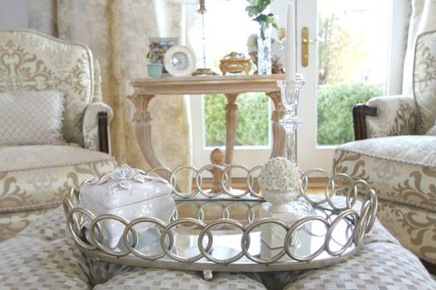
We added a range of accessories to decorate the room once the furniture and window treatments were installed. When designing a room, you can’t skip the accessorizing! Well-chosen accessories help your house feel like a home.

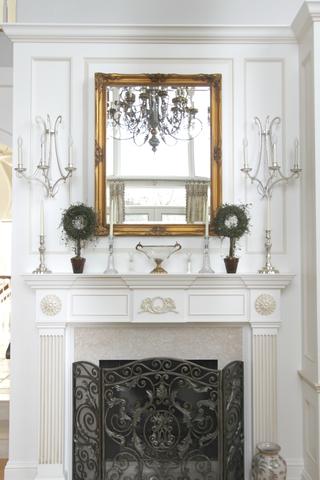
All of the other elements of the room, from the chandeliers to the millwork, were chosen to complement the beautiful damask fabric and dove gray walls. With thousands of paint colors, lighting options, and complementary fabric options on the market, we had to pay very close attention to detail to ensure that all the elements of the room worked in harmony together.
The sun room of this home is large and very bright. The abundance of sunshine saturates colors, so we had to be careful to pick shades that wouldn’t get washed out easily. We decided to go with pinks, greens, and florals to make the room pop and to reflect the beautiful landscape design surrounding the room. Since the sun room is adjacent to the master bedroom, we made sure to choose colors that would complement that essential space.

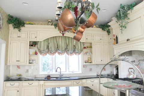
For the kitchen we selected a unique light fixture that has hanging space to display our client’s collection of copper pots and pans, in a variety of shapes and sizes. The color palette for the kitchen complements that of the adjacent sunroom.