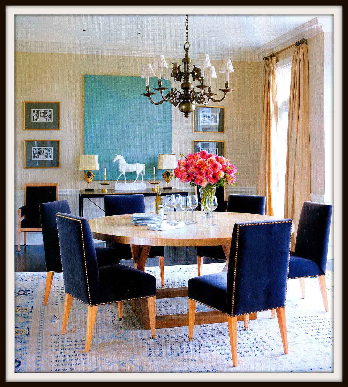
Part of our philosophy at Marilyn H. Rose Interiors is to create classic designs that feel totally current. When someone views the website to see our portfolio, the goal is to have timeless photos with the viewer having no idea when they were completed. Some of our designs last for over 15 years. This is why we choose to use classic colors that will always be in style.
Classic Colors, Timeless Design
We love the photo above (taken from Architectural Digest) because it takes three historical colors and makes them feel new. The design itself is serene with pops of color, combining modern and antique pieces making the room eclectic, yet harmonious.
By looking at this photo, we were able to pinpoint three colors taken directly from Benjamin Moore’s Historic Williamsburg Collection:
a. Cheseapeake Blue – historically, the color you see in the painting is referred to as Tiffany Blue. The color (trademarked by Tiffany & Co.) was first used in 1845 on the cover of Tiffany’s Blue Book and is now used again and again (Wikipedia).
b. Washington Blue – historically, the color you see in the chairs is referred to as Navy Blue. The color, originally known as Marine Blue, got its name from the dark blue worn by officers in the British Royal Navy since 1748 (Wikipedia).
c. Getty White – historically, the color on the walls and in the window treatments is referred to as Beige. Beige was used as a color term in the modern sense in France beginning approximately 1855-60. The first recorded use of beige as a color name in English was in 1887 (Wikipedia).
When choosing colors for a space in the future, try not to think about what’s popular right now. Instead, think about what feels comfortable and soothing to you. You could even do a little research. Was this color in style before? Is it still in style? Or has it disappeared completely? This might help you choose. Typically, history repeats itself and what’s old is new. –

